
Project 1
Material strategies; material translation (analog to digital)
Course Description
This course introduces illustration as visual communication through drawing, design thinking, and material experimentation. You will learn how to control line, value, composition, and shape language to guide the viewer’s eye and communicate mood or meaning. We will work in both analog and digital formats, focusing on process, iteration, and critique so you can build a flexible workflow and start developing a personal style.
Project Concept
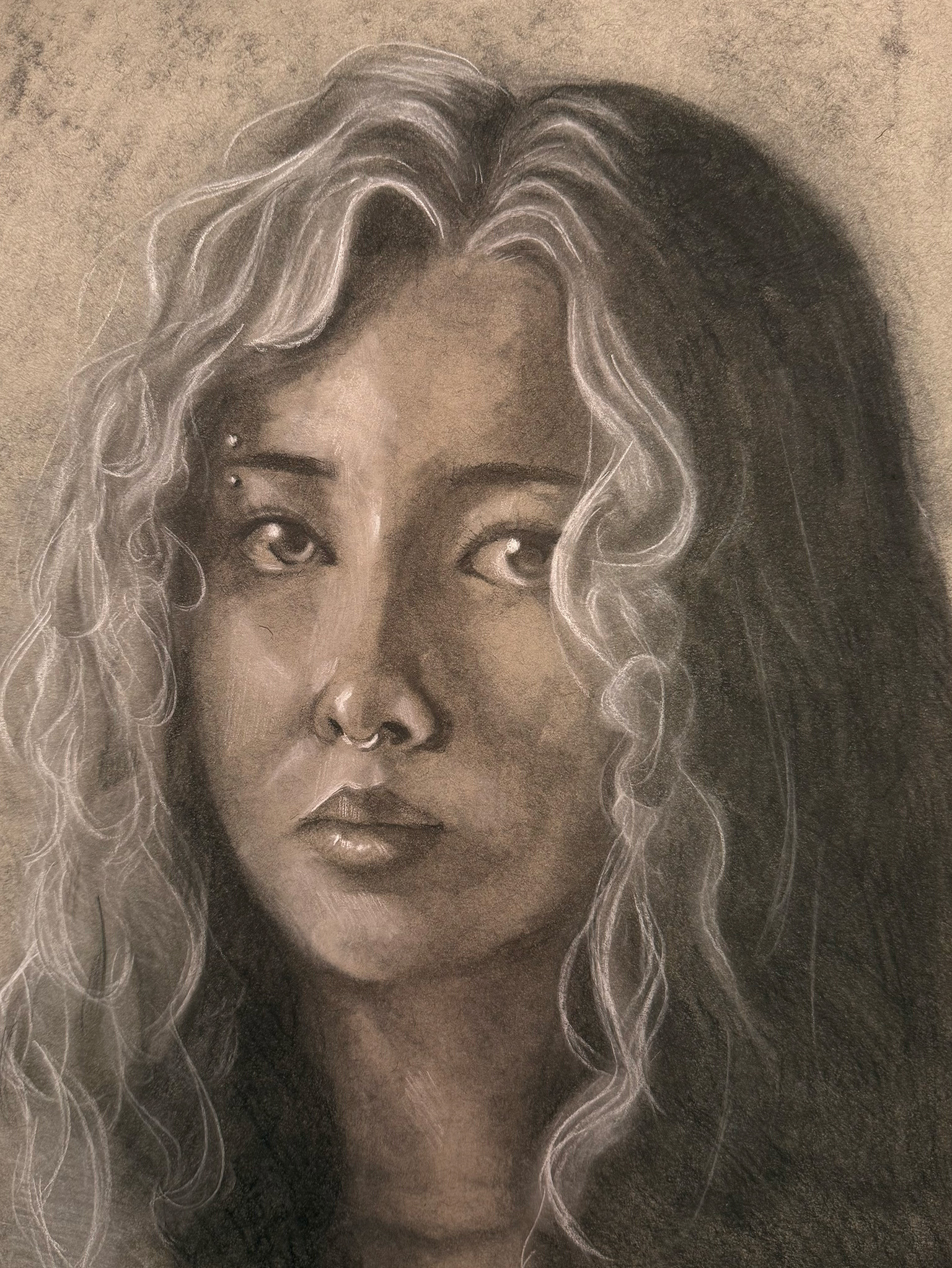
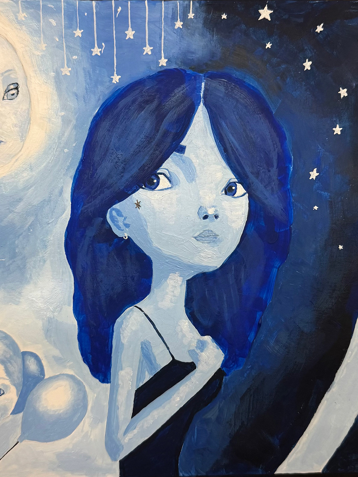
Project 1 is about learning how materials make meaning. You will create one finished drawing using black pencil/pen only, building it through intentional mark-making, value control, and strong shape decisions. Then you will translate that same image into a digital illustration style (surrealism, minimalism, expressive line work, or flat illustration). The goal is to understand what changes when you switch tools and what stays consistent when your idea is strong. Your final submission will show both versions side-by-side, along with clear notes on your translation choices.
Project Objectives
By the end of this project, you should be able to:
Build a strong analog drawing using mark-making systems, line quality, and value range to communicate mood or story.
Use composition (focal point, balance, movement, negative space) to control how the viewer reads the image.
Make intentional choices with shape language (soft vs sharp, organic vs geometric, simplified vs complex) to support meaning.
Translate an analog drawing into a digital illustration style while keeping the core concept intact.
Compare the two versions and explain: what changed (shape, line, contrast, detail, mood, composition, color if used) and what stayed consistent (idea, story, focal point, mood).
Present your work professionally with clear process documentation and critique-ready visuals.
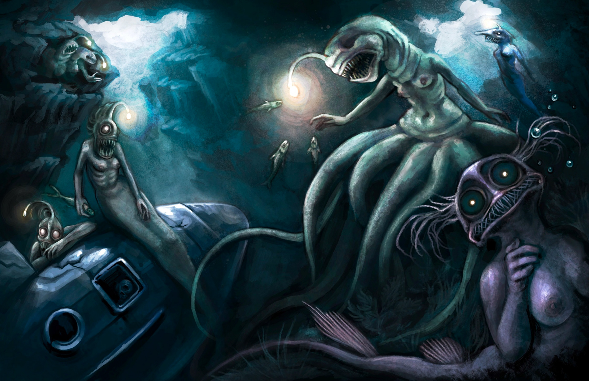
Veronica x. _2026 Spring _ART 325_2 Illustration_11" x 17"
Hannah x. _2026 Spring_ART 325_Illustration_11" x 17"
Elle x. _2026 Spring_ART 325_Illustration_11" x 17"
Morgan x. _2026 Spring_ART 325_Illustration_11" x 17"
Shannon x. _2026 Spring_ART 325_Illustration_11" x 17"
JD x. _2026 Spring_ART 325_Illustration_11" x 17"
Kaelyn x. _2026 Spring_ART 325_Illustration_11" x 17"
Gabe x. _2026 Spring_ART 325_Illustration_11" x 17"
Kiera x. _2026 Spring_ART 325_Illustration_11" x 17"
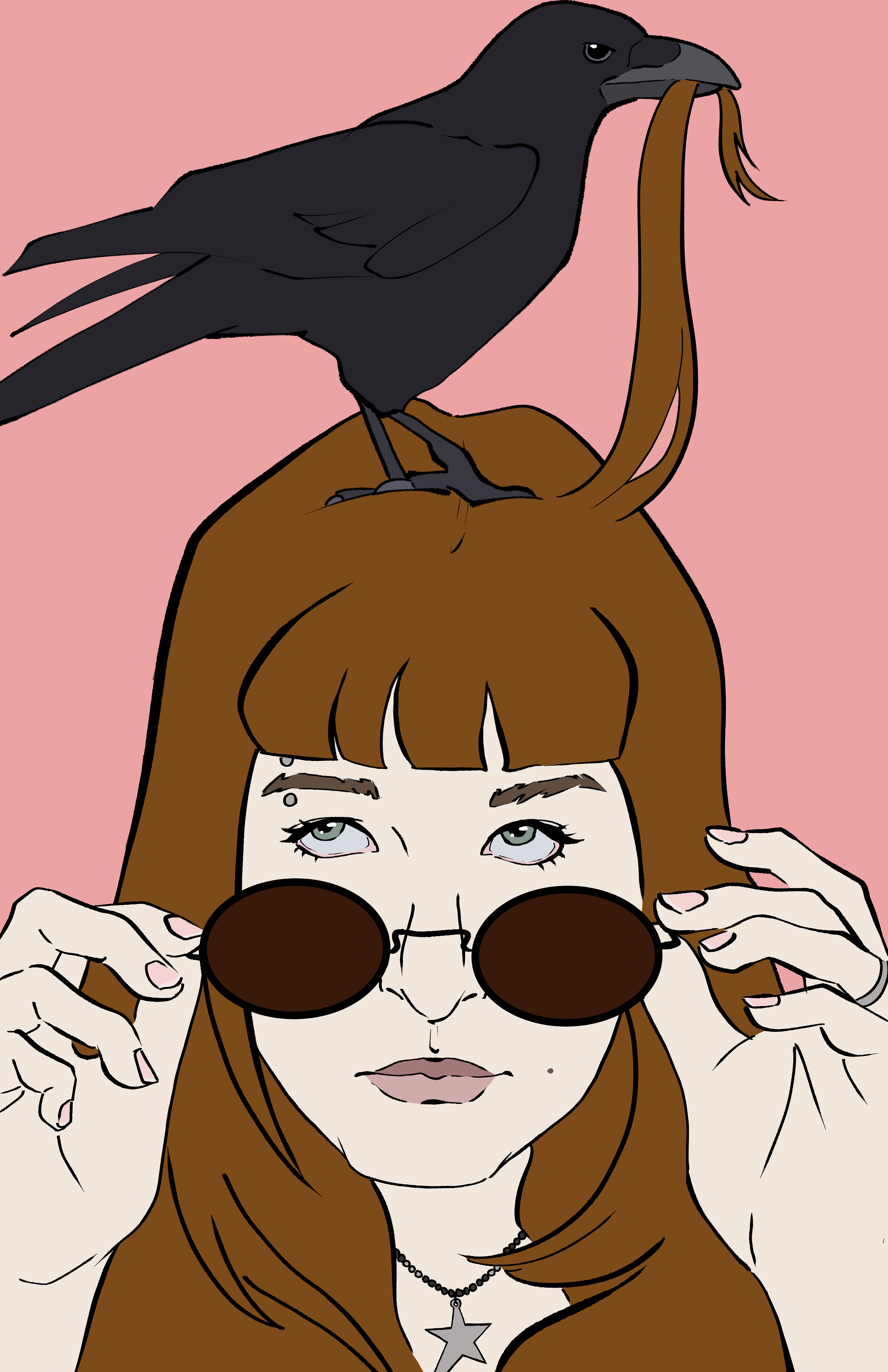
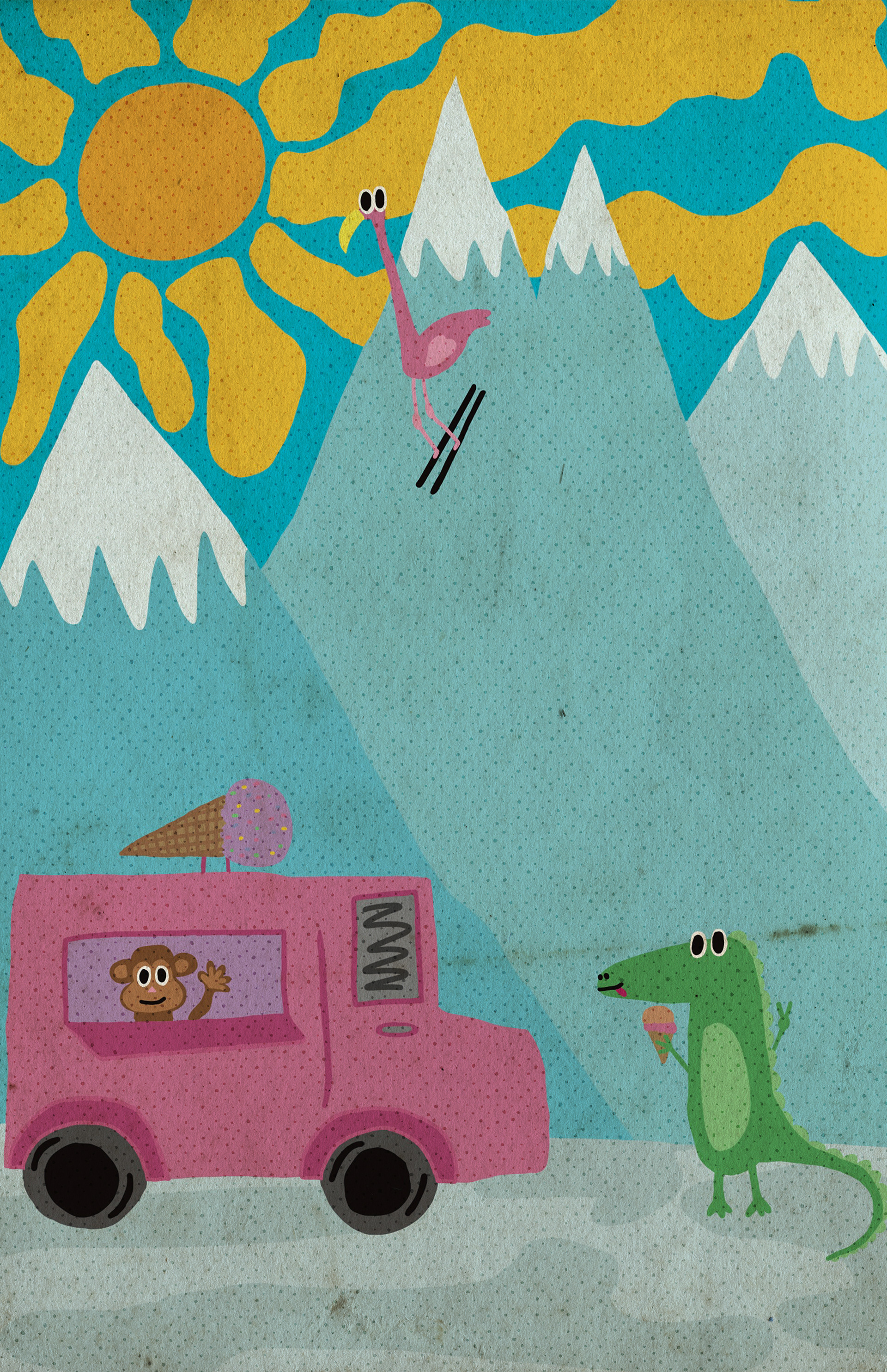
Project 2
Project 2: Editorial Metaphor Cover
Course Description
This course also treats illustration as visual argument. You will learn how to turn ideas into images that read quickly and clearly, using composition, value structure, symbol, and text. We willl study historical and contemporary illustration strategies (including the Golden Age of Illustration) and apply them to editorial design problems. The course emphasizes concept development, research, iteration, critique, and professional presentation across both analog and digital workflows.
Project Concept
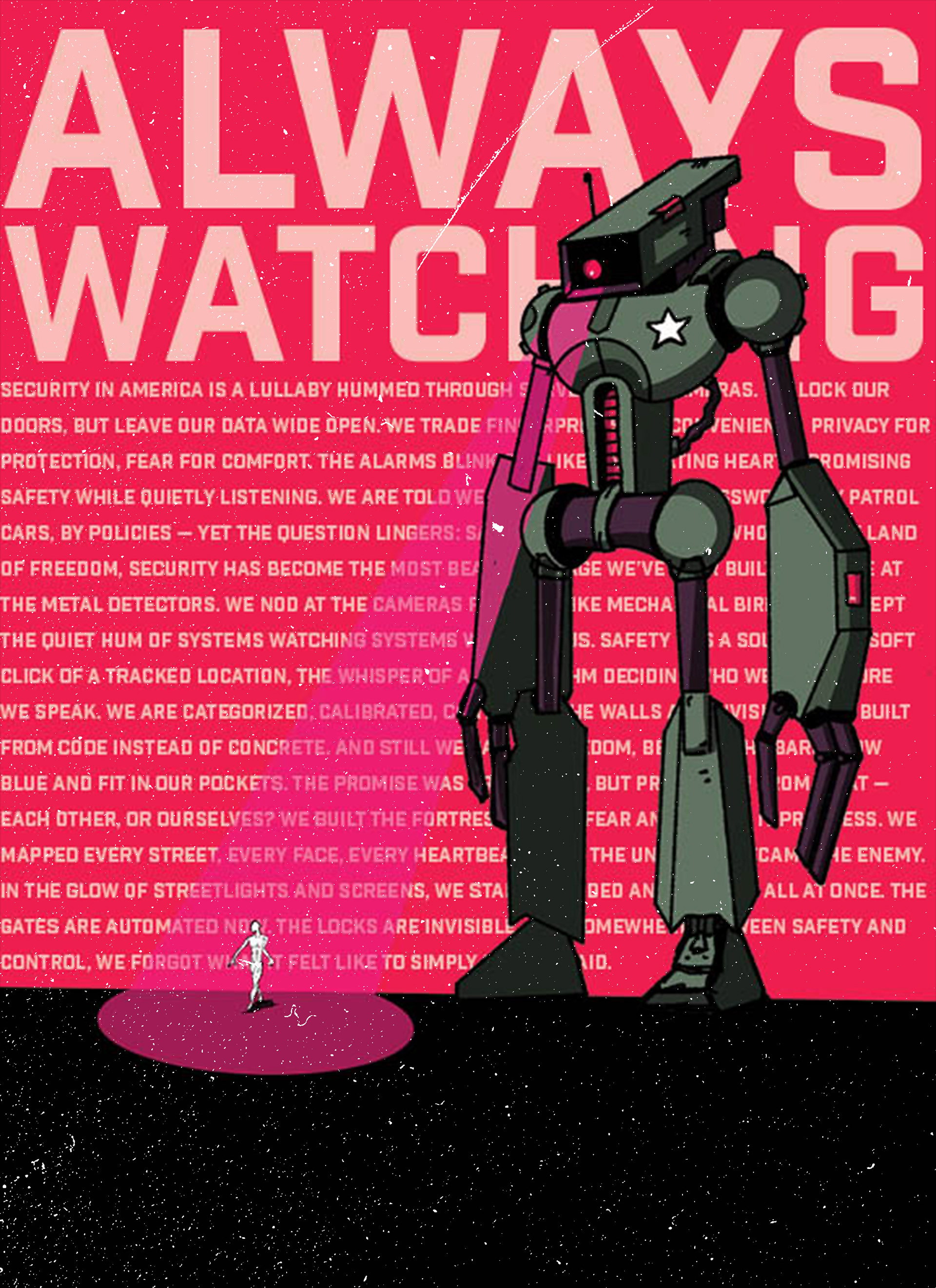
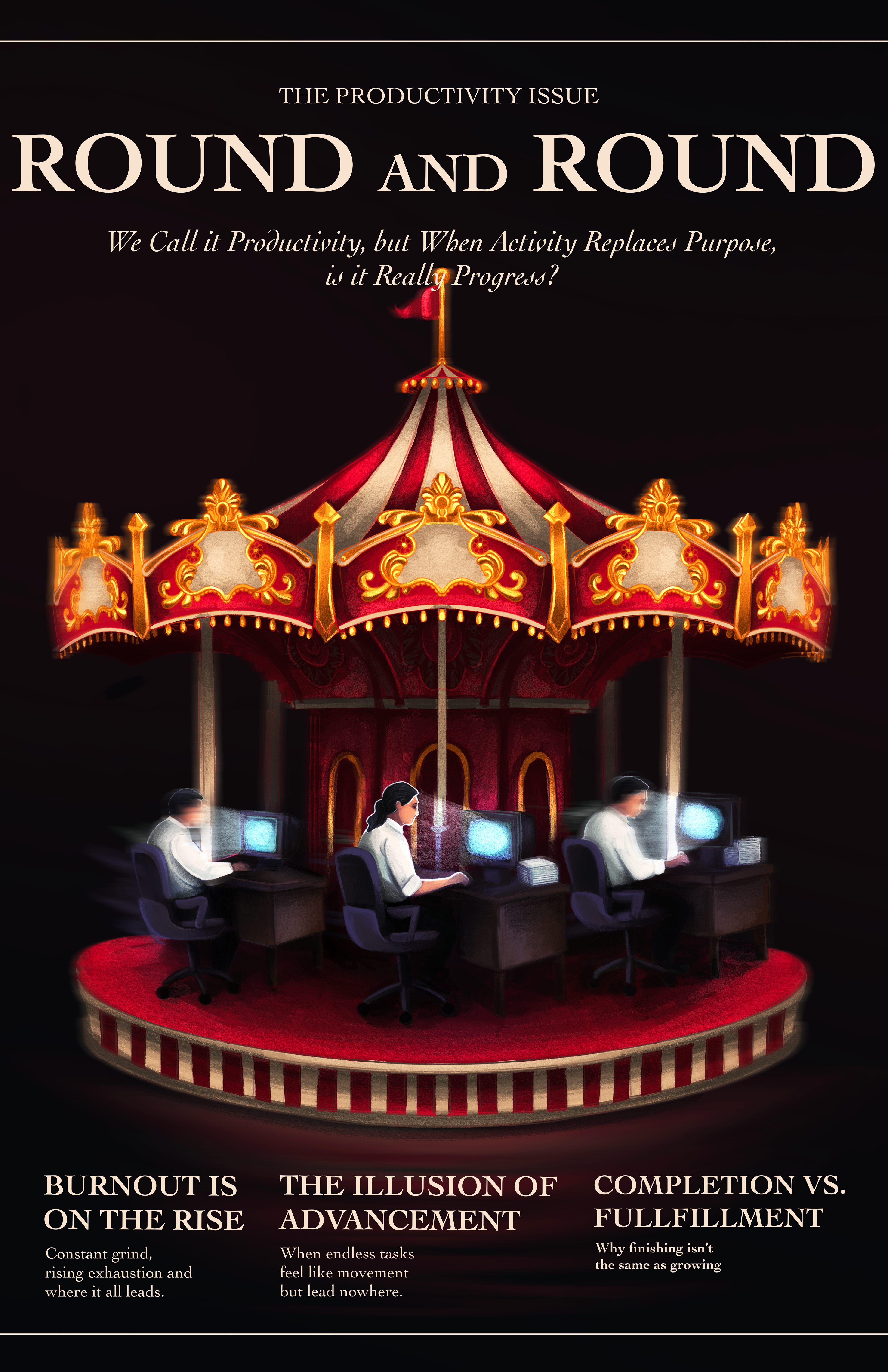
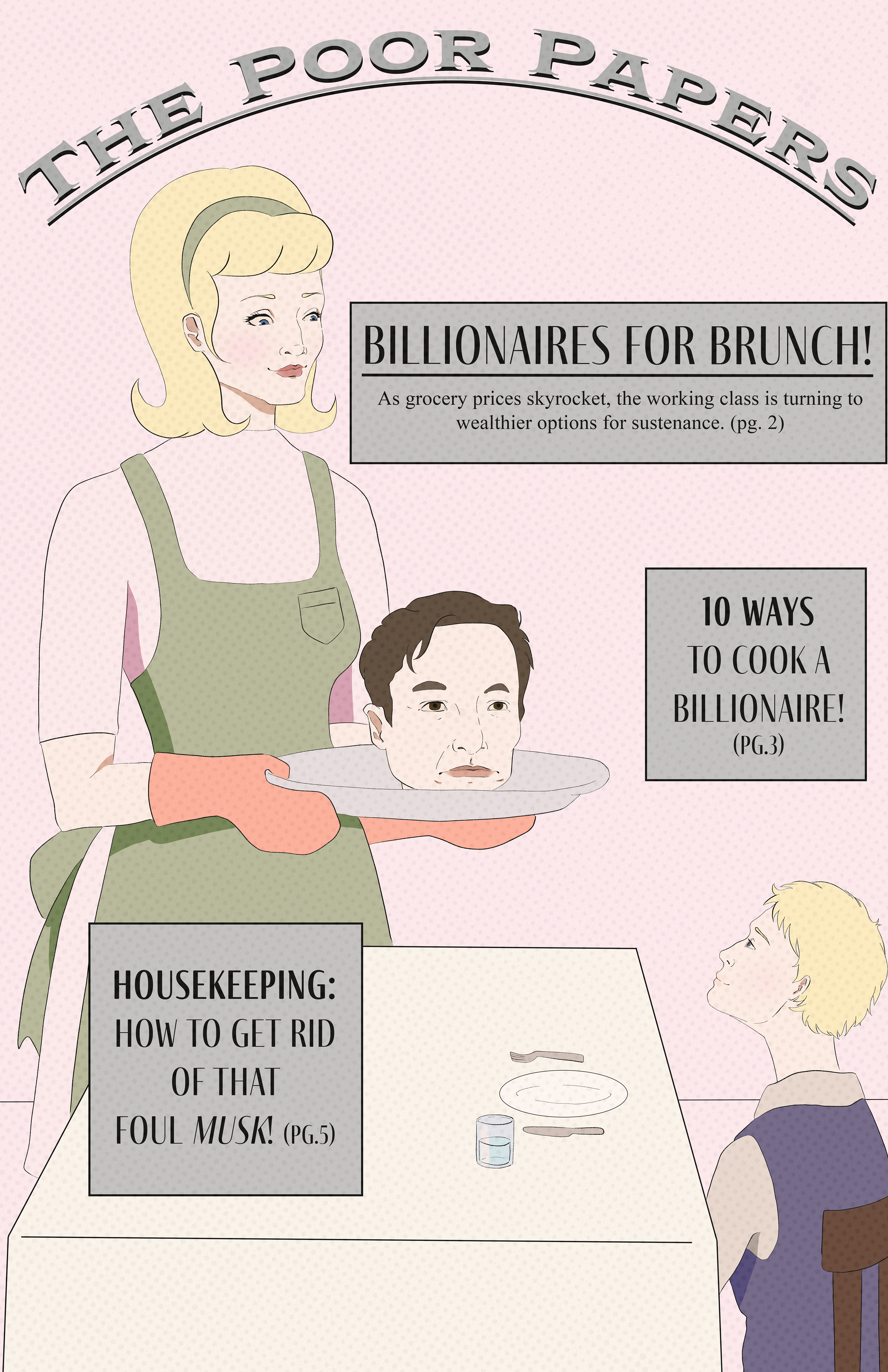
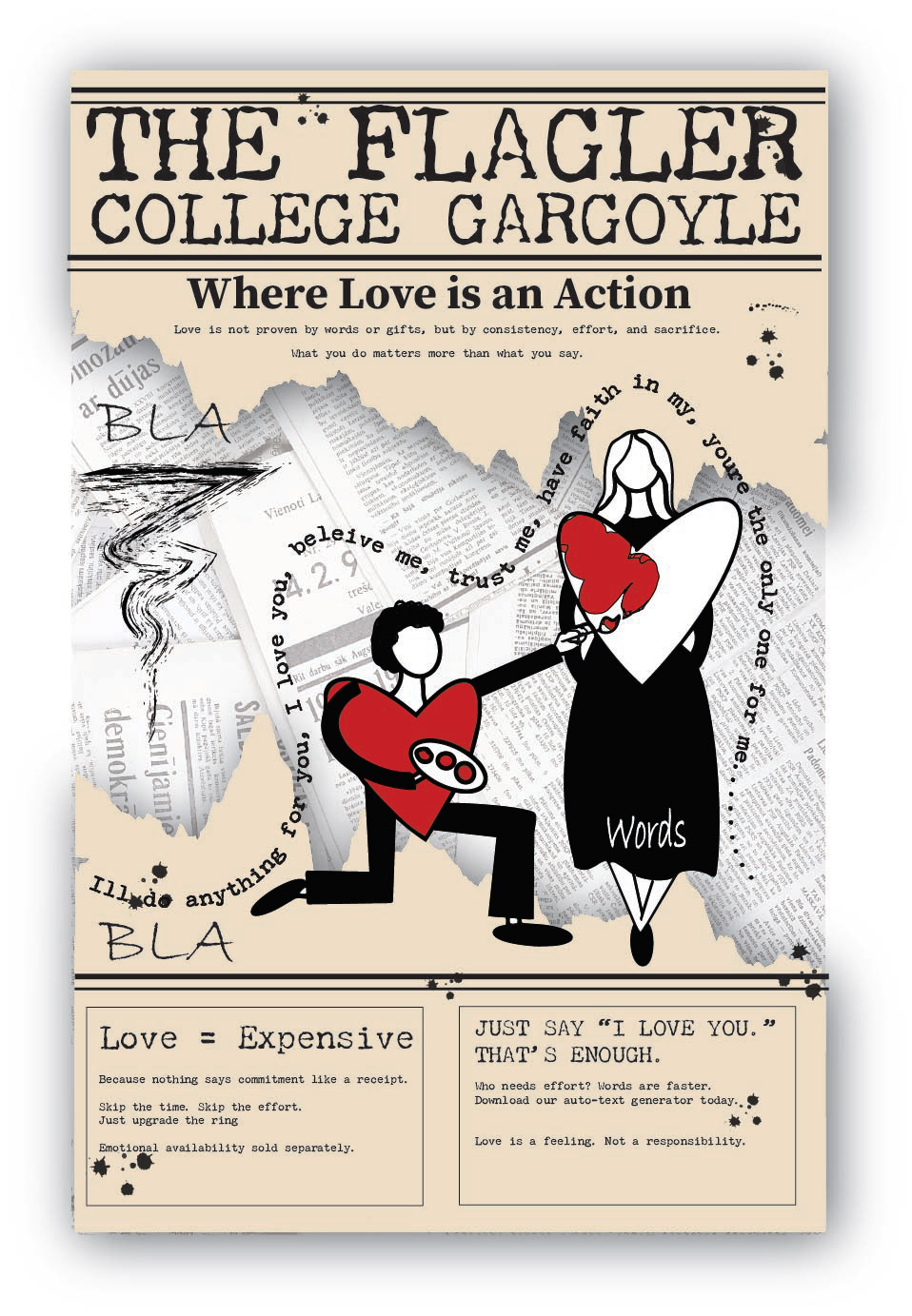
Project 2 asks you to design a front-page cover for The Flagler College Gargoyle that communicates a clear opinion through visual metaphor. Your cover should be readable in three seconds from across the room: one dominant illustration, strong staging, bold value structure, and text that supports the message (headline, deck, and teasers). You will ground your argument in one philosopher (Plato, Foucault, Marx, Camus, or bell hooks), then build a metaphor using strategies like transformation, substitution, scale shift, contradiction, or trap reveal. The “Golden Age of Illustration” look is not just a style choice, it’s a communication strategy: silhouette clarity, graphic ornament, limited color, and intentional handmade texture that makes the message land fast.
Project Objectives
By the end of this project, you should be able to:
Write a focused claim (one-sentence argument) connected to a philosopher and a real issue in campus life/culture.
Translate an abstract idea (surveillance, commodification, appearance vs reality, absurd work, love as practice) into a clear visual metaphor.
Design an 11” x 17” cover that reads quickly using dominant focal point, clear staging, and strong value hierarchy.
Integrate headline, deck, and teasers so the text supports the metaphor and feels like a believable newspaper front page.
Use “Golden Age of Illustration” visual strategies: bold silhouette, limited color, graphic ornament, and handmade texture with intentional craft.
Develop and refine ideas through a professional process
Present work with strong documentation: studies, final analog + digital versions, peer critique questions, and a short reflection explaining design choices and principles.
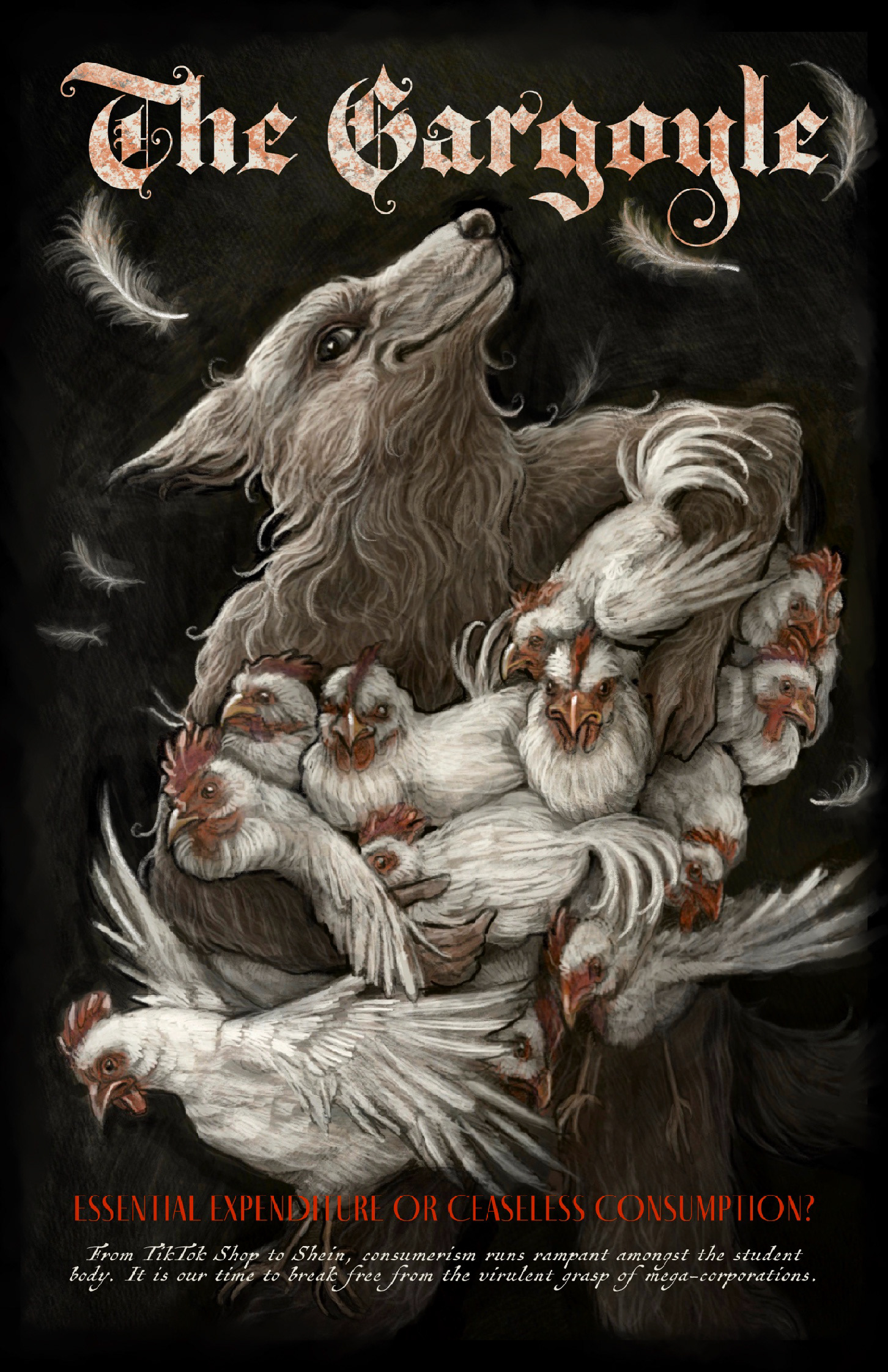
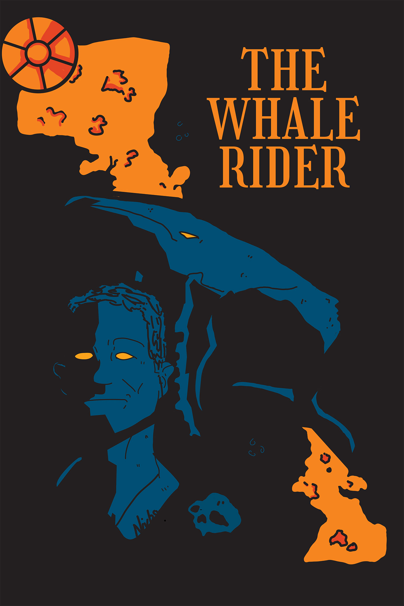
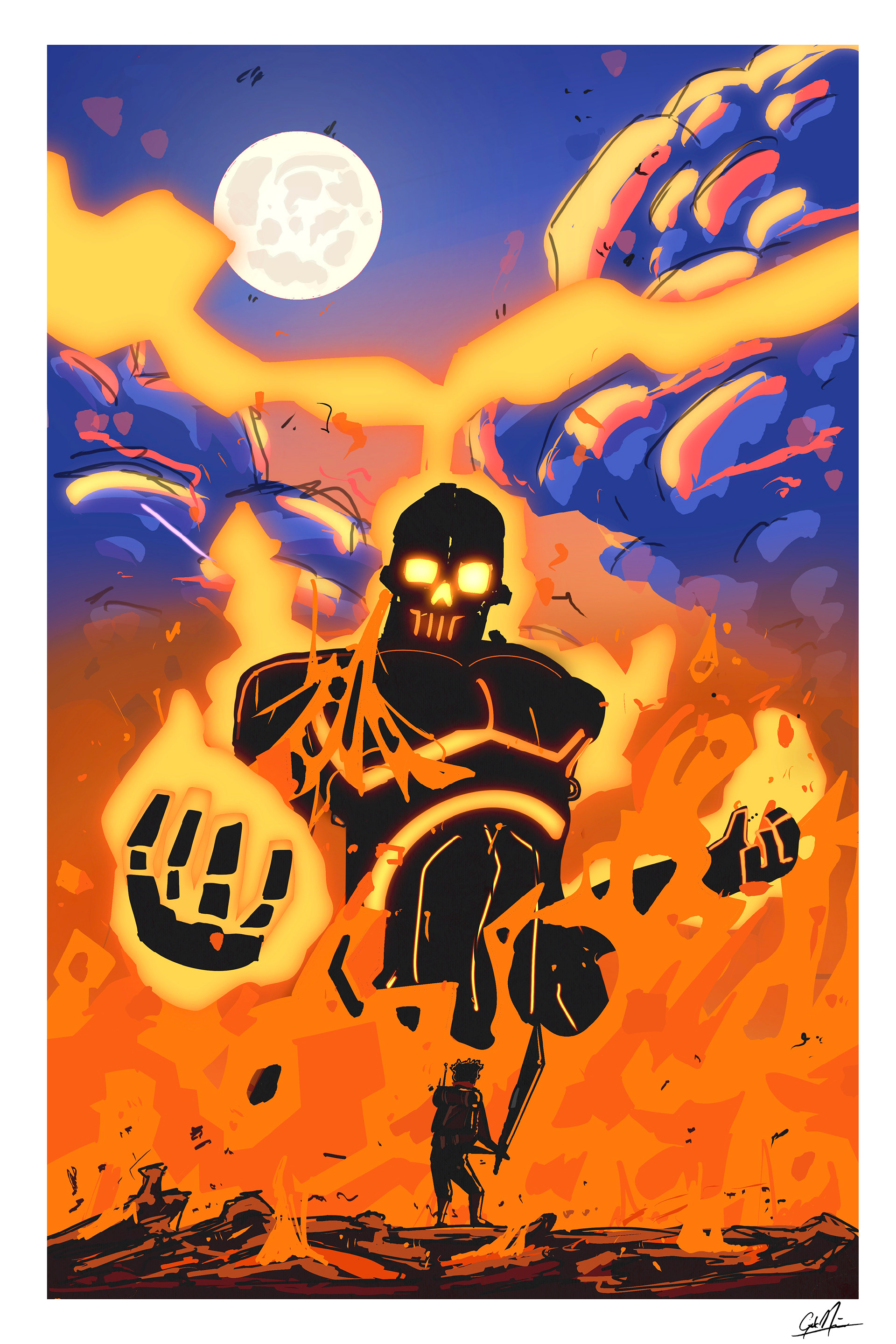
Shannon x. _2026 Spring_ART 325_Illustration_11" x 17"
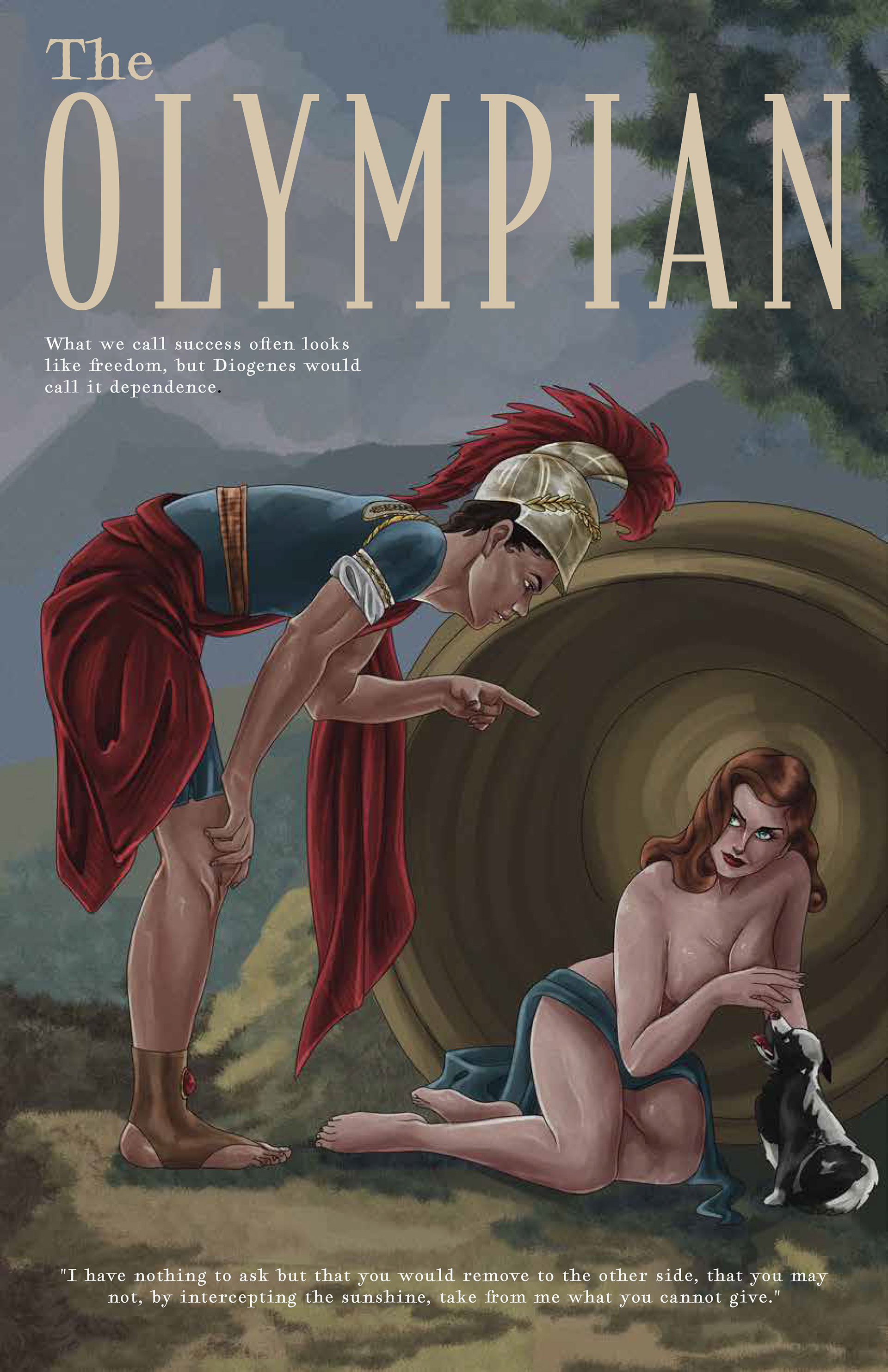
Kaelyn x. _2026 Spring_ART 325_Illustration_11" x 17"
Gabe x. _2026 Spring_ART 325_Illustration_11" x 17"
Veronica x. _2026 Spring_ART 325_Illustration_11" x 17"
Elliie x. _2026 Spring_ART 325_Illustration_11" x 17"
Averi x. _2026 Spring_ART 325_Illustration_11" x 17"
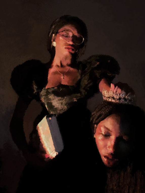
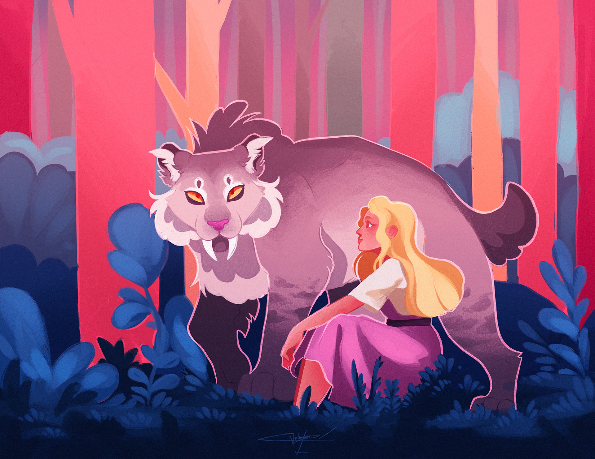
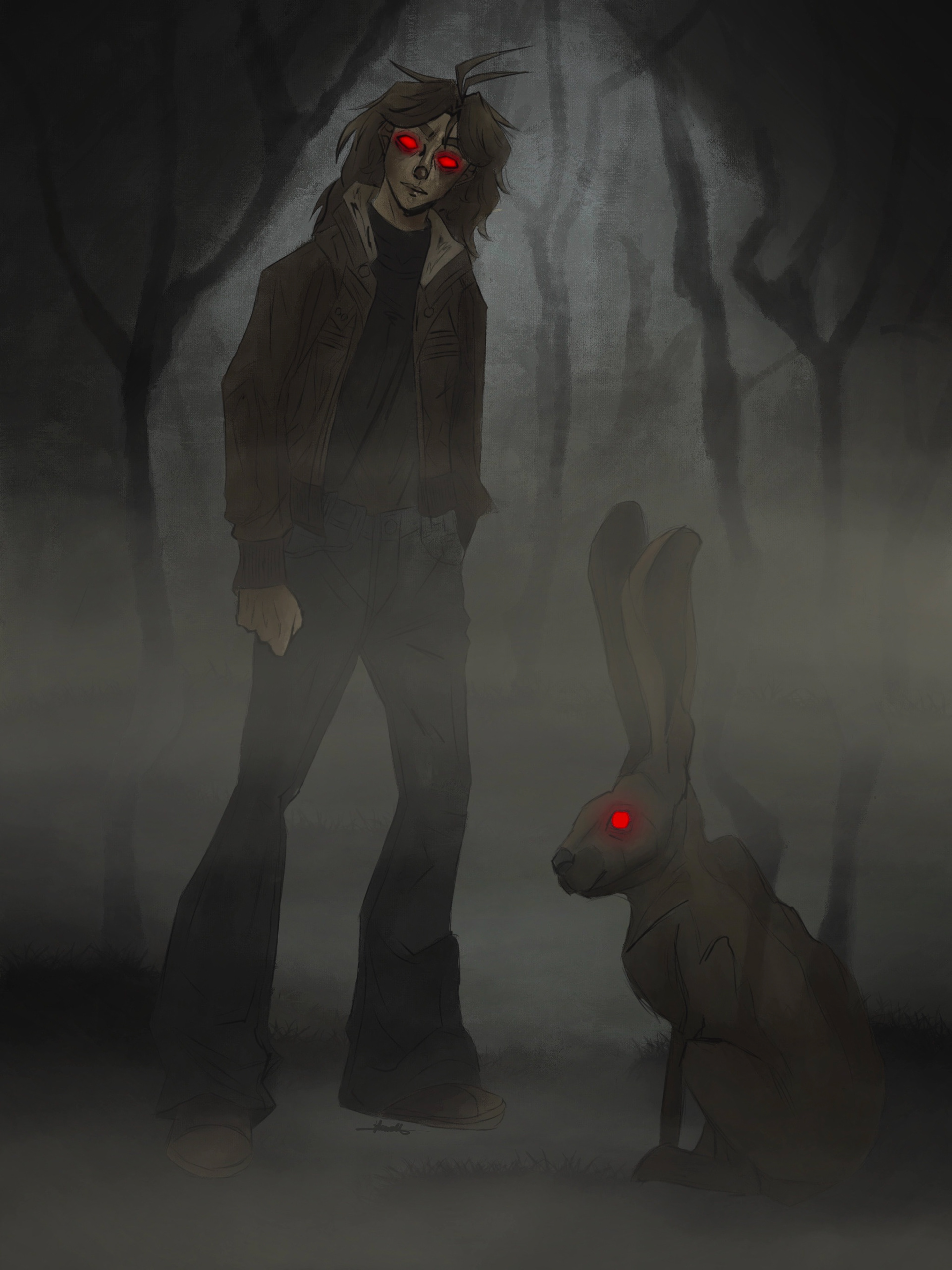
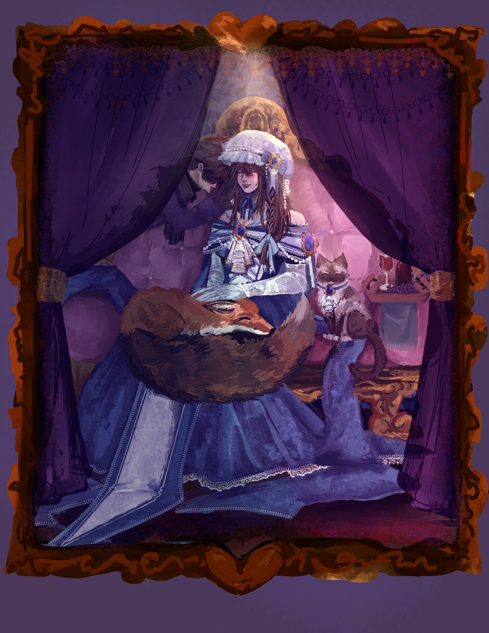
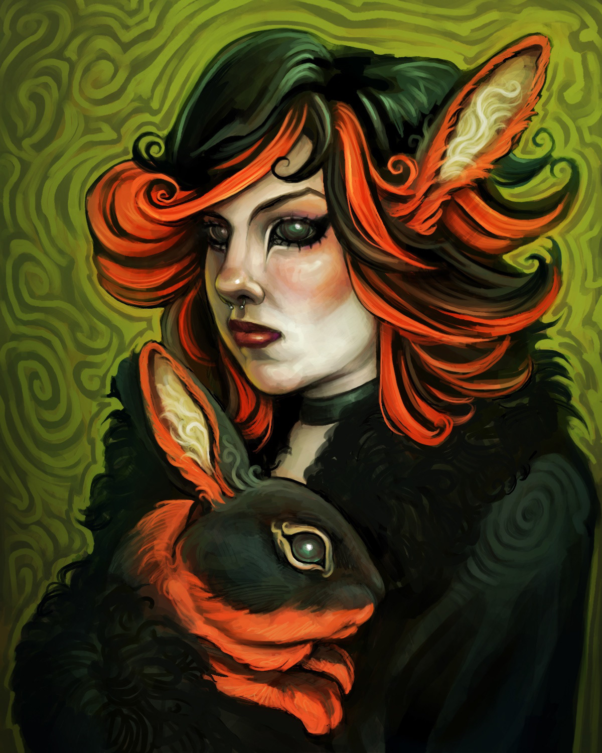
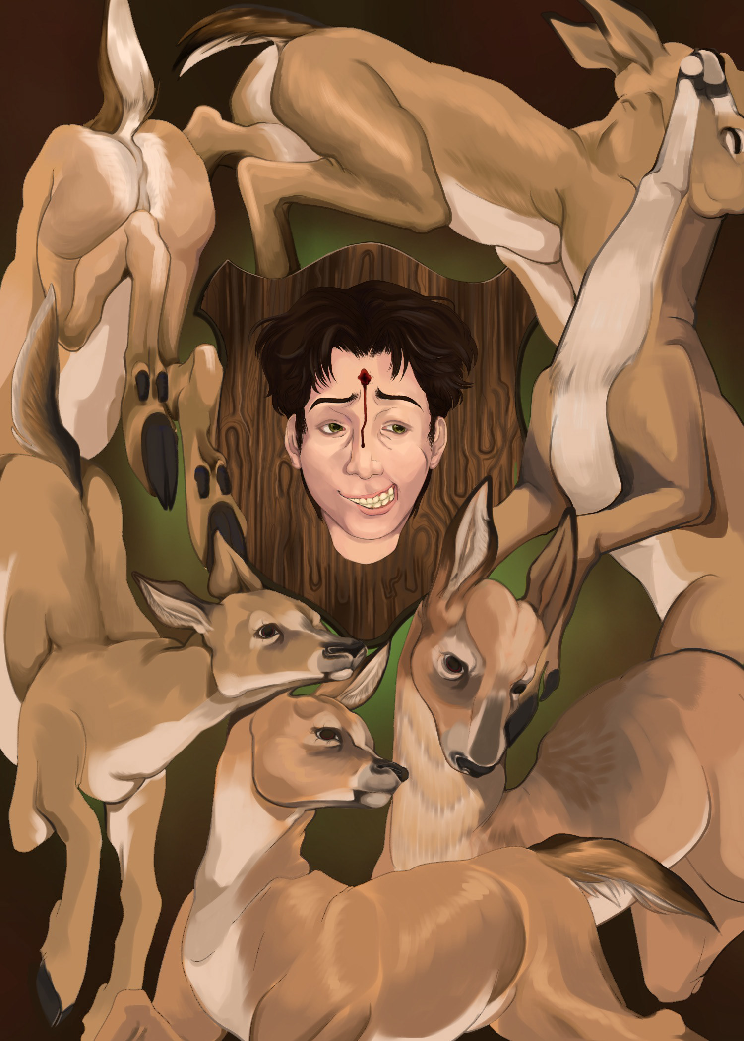
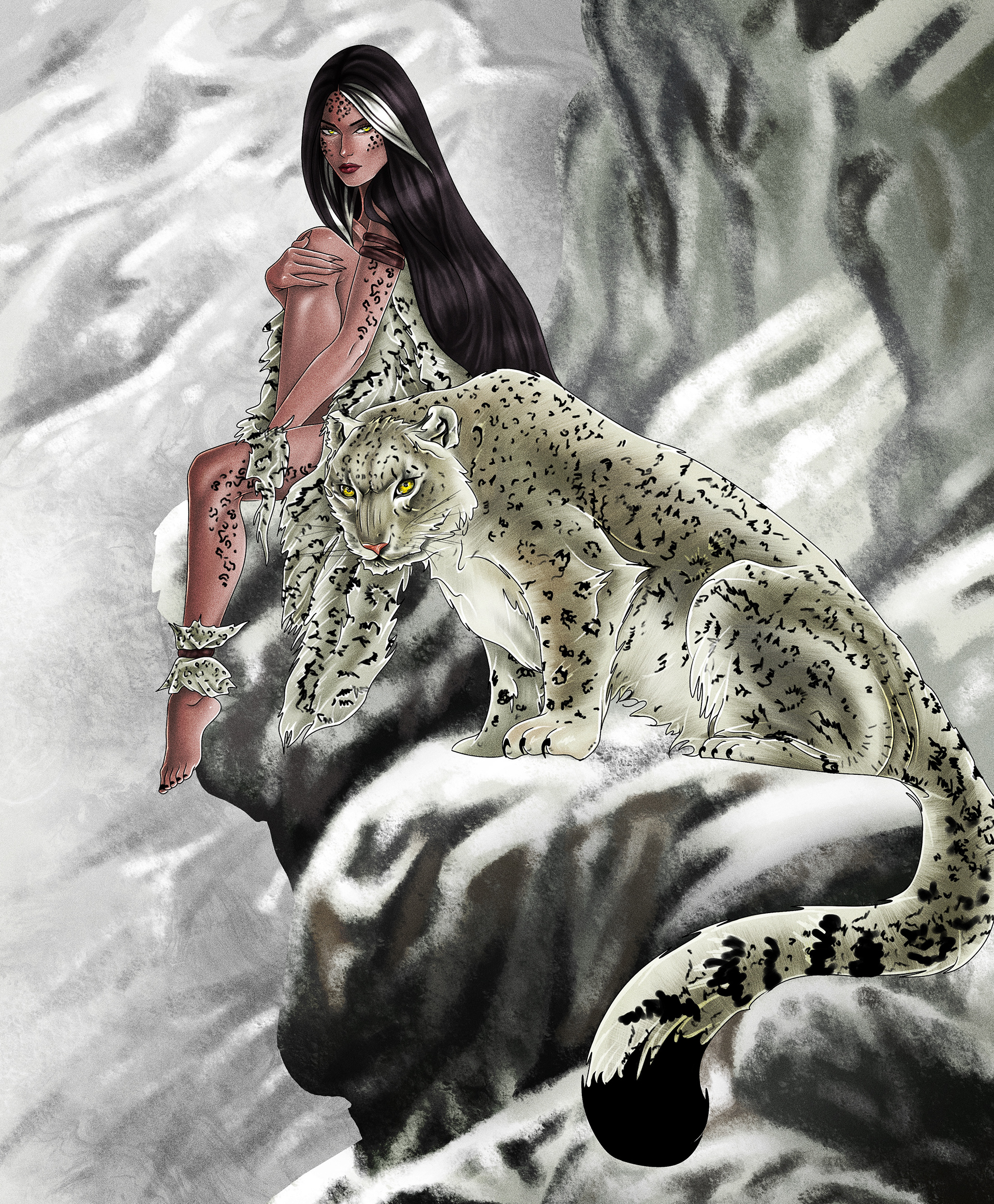
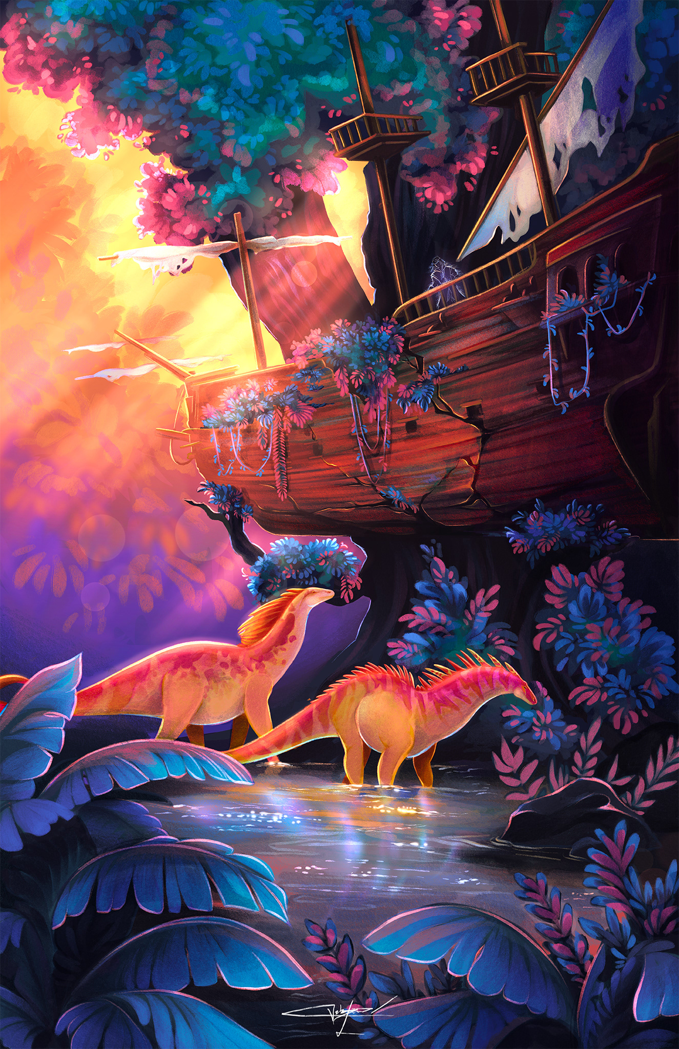
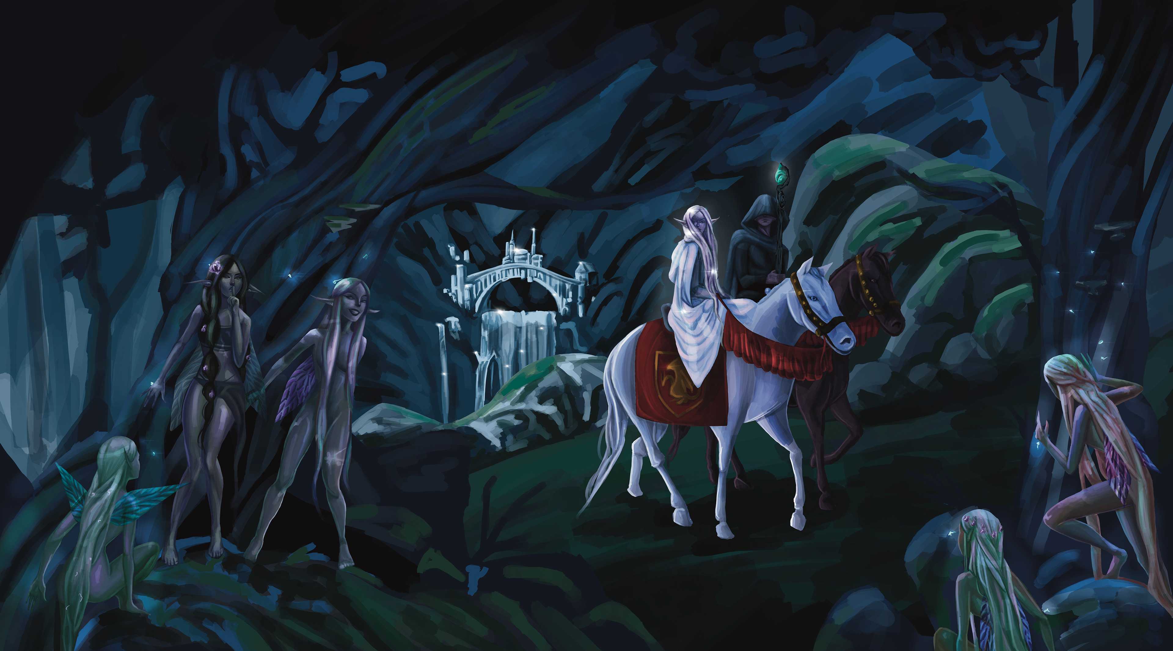
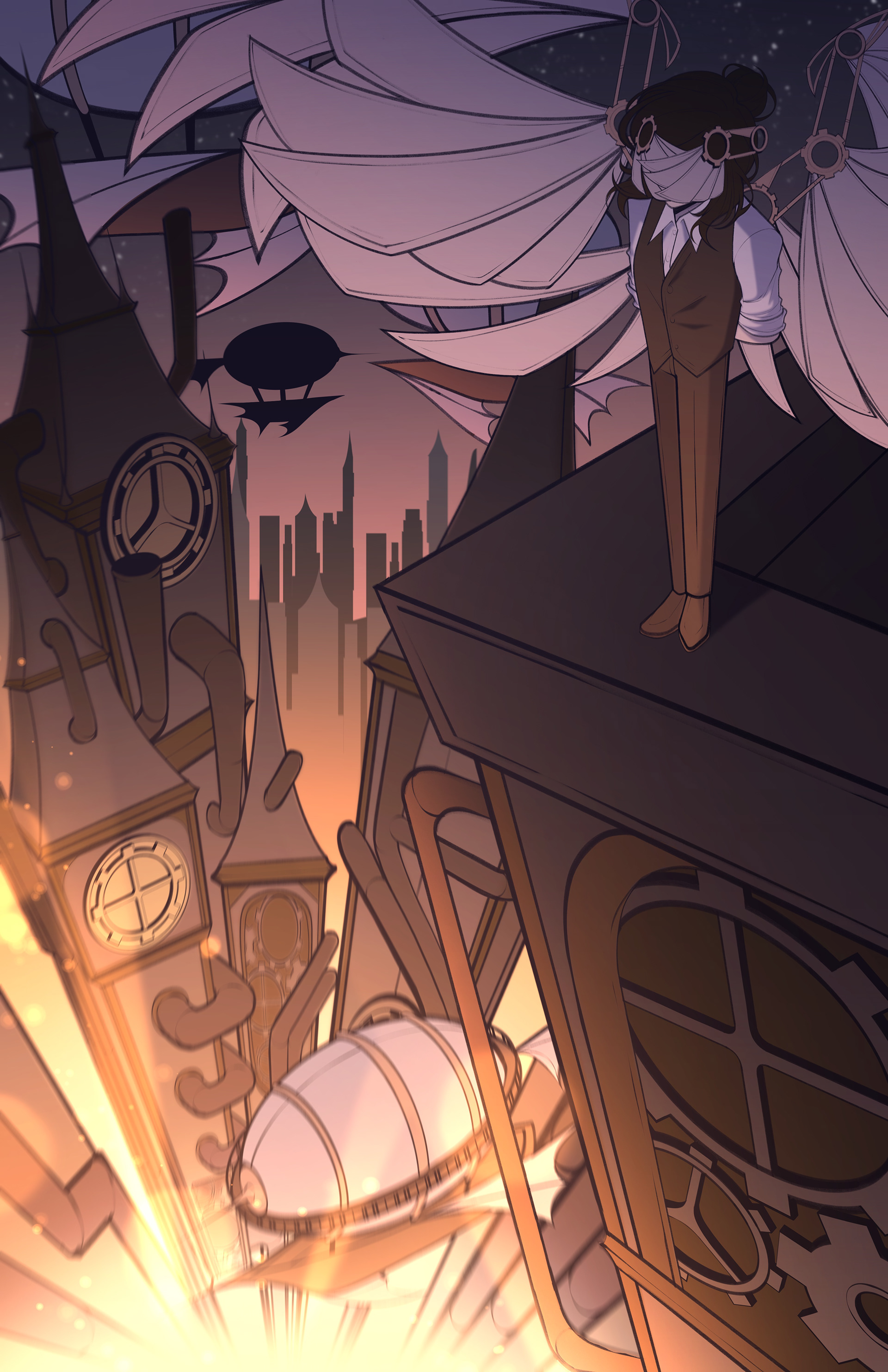
Project 3: Character + Environment (Worldbuilding)
Course Description
This project introduces students to worldbuilding through illustration by combining character design and environment design. Students will create an original character placed within a setting that reveals something meaningful about their life, role, or personality. The project emphasizes how illustration can communicate story through visual choices rather than written explanation.
This project introduces students to worldbuilding through illustration by combining character design and environment design. Students will create an original character placed within a setting that reveals something meaningful about their life, role, or personality. The project emphasizes how illustration can communicate story through visual choices rather than written explanation.
Project Concept
The focus of this project is to explore how character and environment work together to create narrative meaning. Students will think about clothing, posture, gesture, tools, lighting, composition, and environmental details as storytelling devices. The goal is to create an illustration where the setting does more than act as a backdrop and instead helps define who the character is and the world they belong to.
The focus of this project is to explore how character and environment work together to create narrative meaning. Students will think about clothing, posture, gesture, tools, lighting, composition, and environmental details as storytelling devices. The goal is to create an illustration where the setting does more than act as a backdrop and instead helps define who the character is and the world they belong to.
Project Objectives
By the end of this project, students should be able to:
By the end of this project, students should be able to:
Design an original character with a clear identity and role
Create an environment that supports and expands the character’s story
Use shape language, lighting, mood, and composition to communicate narrative
Integrate character and setting into a unified and believable world
Develop process work through sketches, thumbnails, and studies before completing a final illustration
Present and discuss their work clearly during critique
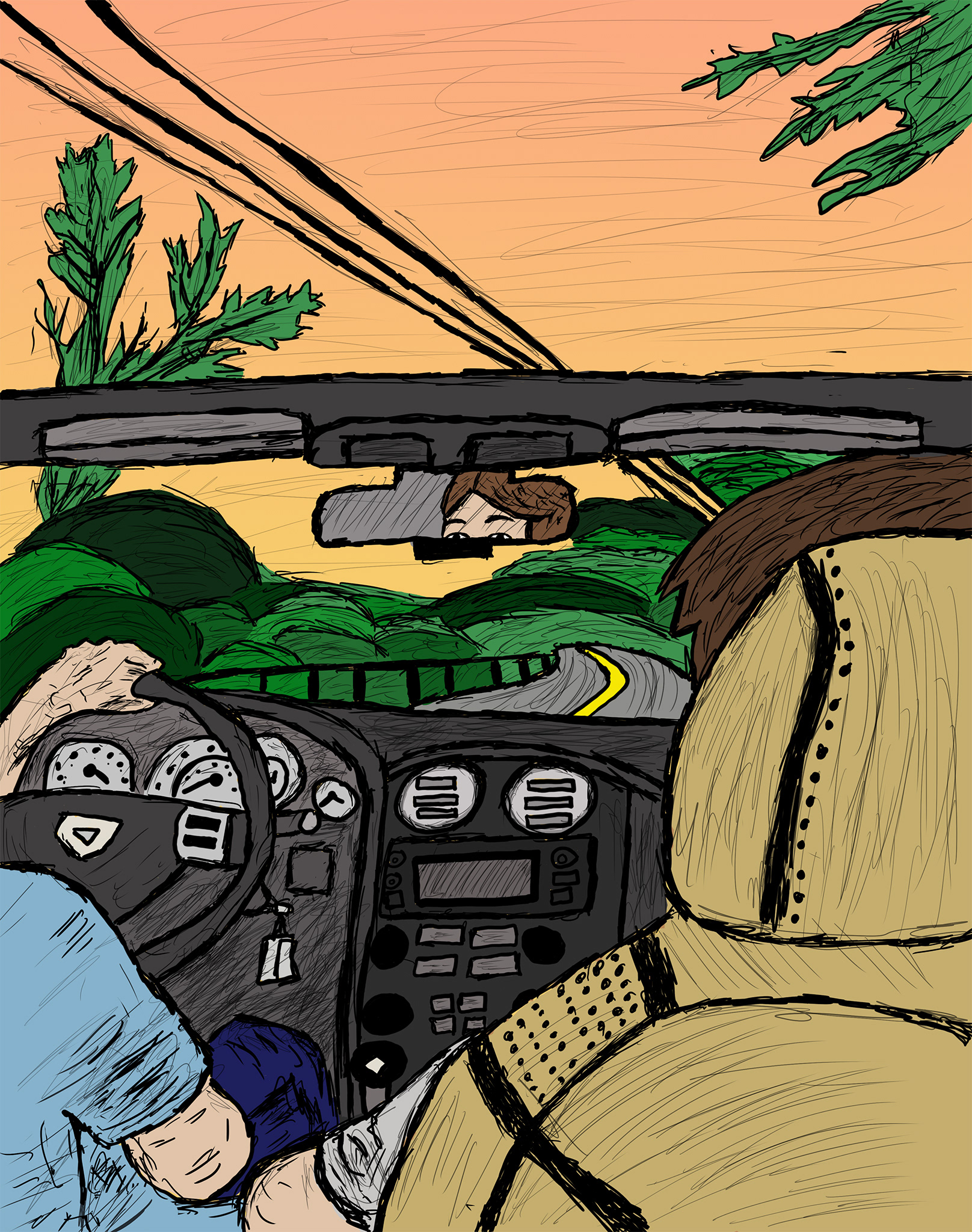
Veronika x. _2026 Spring_ART 325_Illustration_11" x 17"
Kaelyn x. _2026 Spring_ART 325_Illustration_11" x 17"
Cami x. _2026 Spring_ART 325_Illustration_11" x 17"
Liala x. _2026 Spring_ART 325_Illustration_11" x 17"
Shanon x. _2026 Spring_ART 325_Illustration_11" x 17"
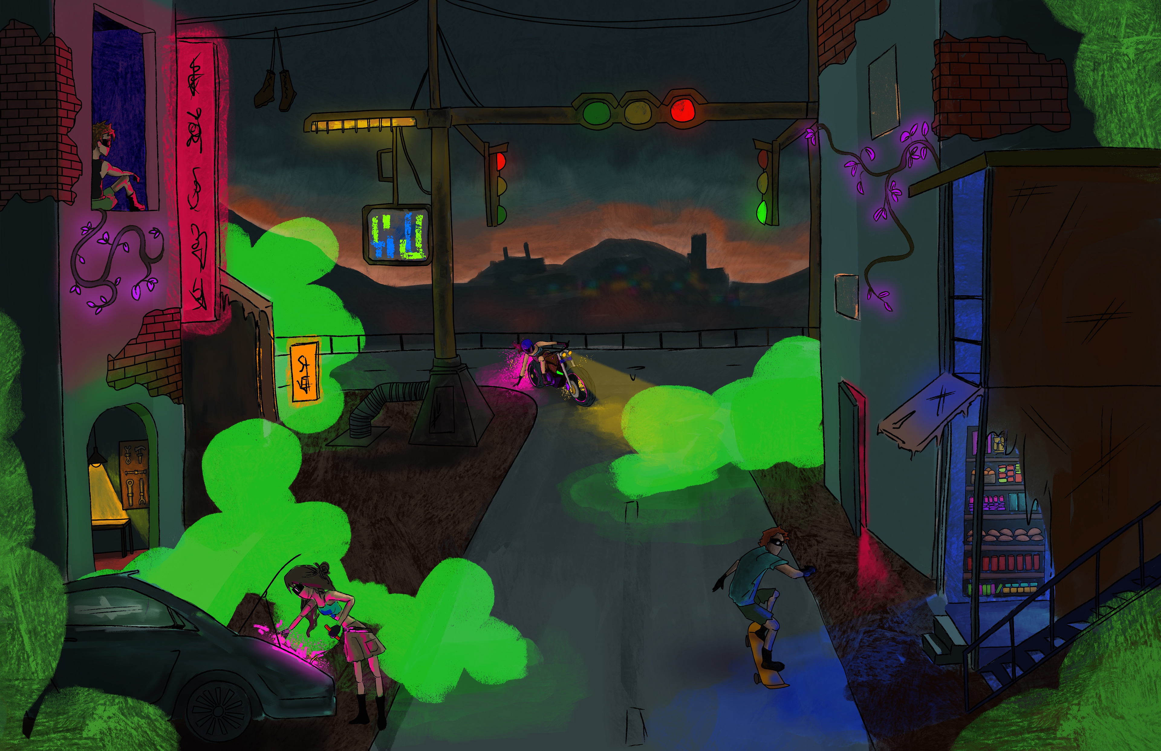
Kayli x. _2026 Spring_ART 325_Illustration_11" x 17"
Gabe x. _2026 Spring_ART 325_Illustration_11" x 17"
Project 4:
Course Description